Jackson Cook
Visual Identity | Website Design
Hammerhead Communications tapped Brand Caddy to refresh their client Jackson Cook’s visual identity and digital presence. With the company changing hands, it was time for Jackson Cook to start fresh with a visual brand to gain consistency at each touch point.
Jackson Cook is a steel fabrication and crane services company serving the Tallahassee area and the surrounding southeast area since 1946. They work on construction projects of varying sizes, and accommodate a wide range of on-site and off-site services.
Our goal in rebuilding their visual identity was ultimately to establish consistency. Various typefaces, colors, and arrangements had been used over the years, with no real concrete visual brand.
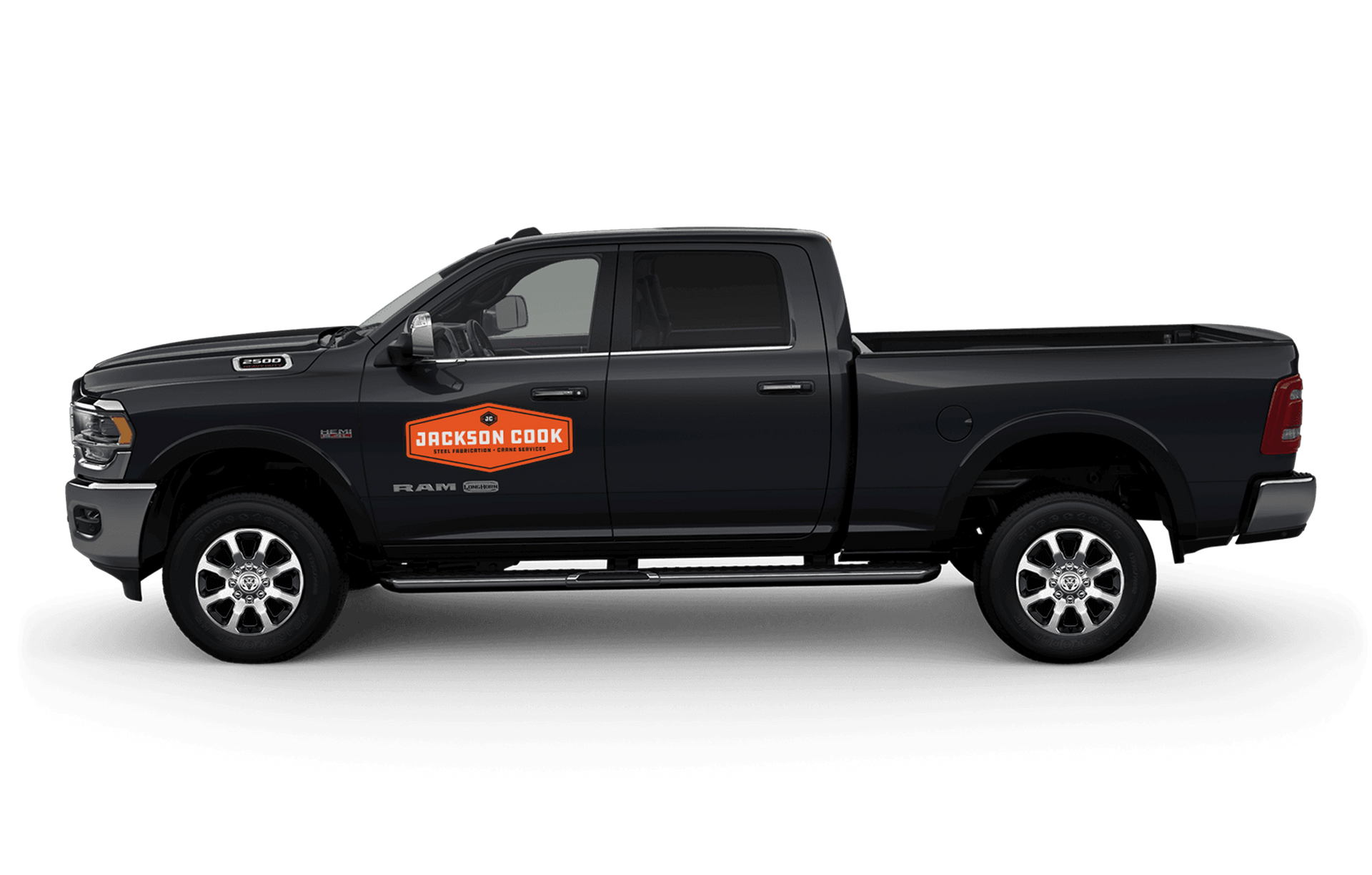
These new designs also had to apply to multiple touch points (cranes, trucks, web, apparel) while still remaining recognizable.
The Scope:
- Responsive Logo
- Brand Pattern
- Color & Typography
- Apparel and Print Collateral
- Social Media Images
- Website Design
Visual Identity Goal:
Create a logo system that:
- Captures an established look, something that’s been around since 1946
- Establishes consistency, with some flexibility for different touch points.
- Stands out from competitors’ logos and colors
Design and Competitive Research
Through the research process with Jackson Cook, Hammerhead and Brand Caddy selected the color, type, and design direction that best embodied the attributes that bubbled to the top in meetings: Established, Utility, and Bold.
As we learned in the research process, there were peers in the space they admired but also wanted to stay distinctly different from. Blues, gray, reds, and a light yellow-ish orange were the predominant colors of those peers.

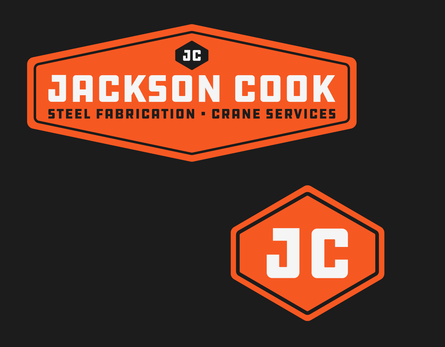
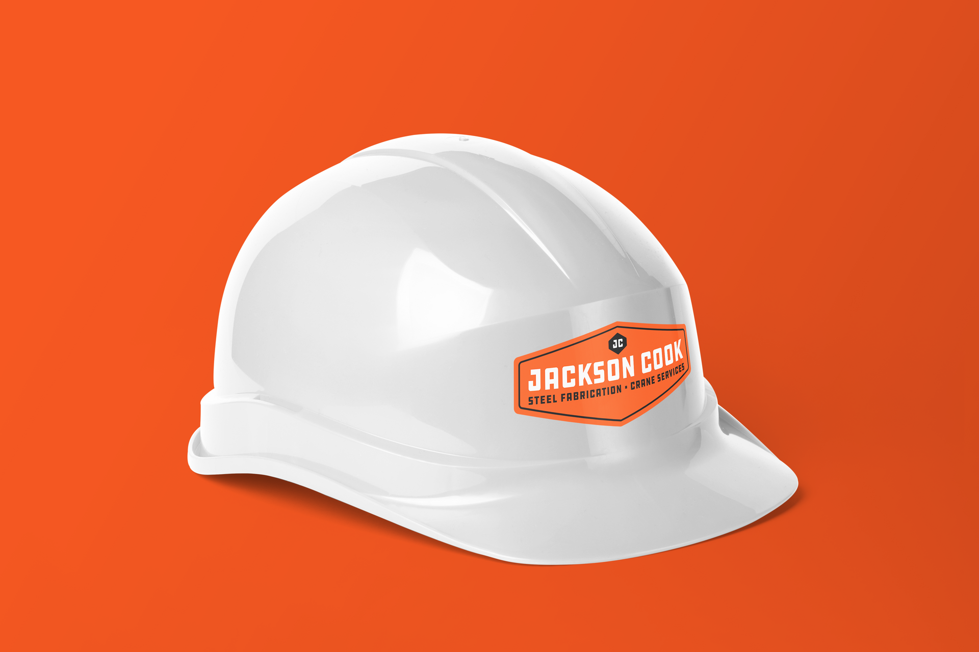
Monogram Icon, Logo, Badges, and Brand Pattern:
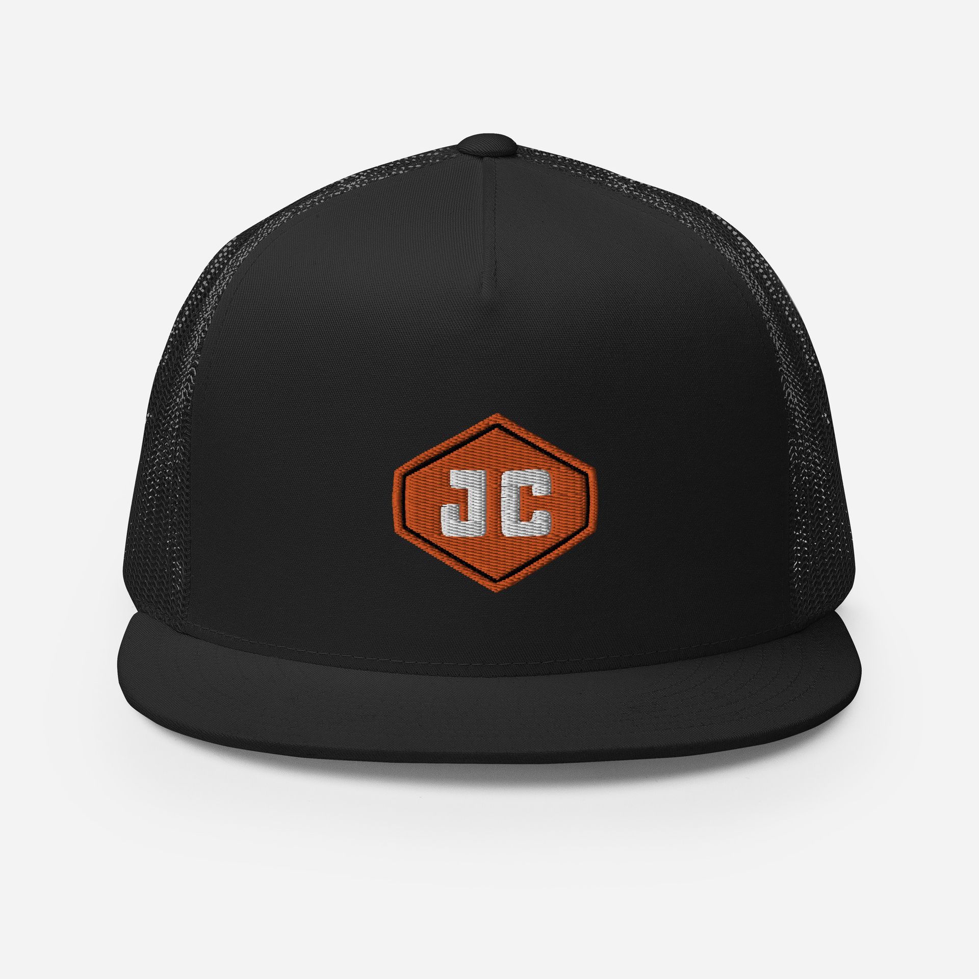
With utility in mind, we designed some traditional sign shapes that were hexagonal as Jackson Cook requested. There were competitors with equilateral hexagon-shaped logos with sharp angles. We opted for the oblong hexagon shape with rounded corners (also mirroring the rounded corners of the block lettering of the logo)
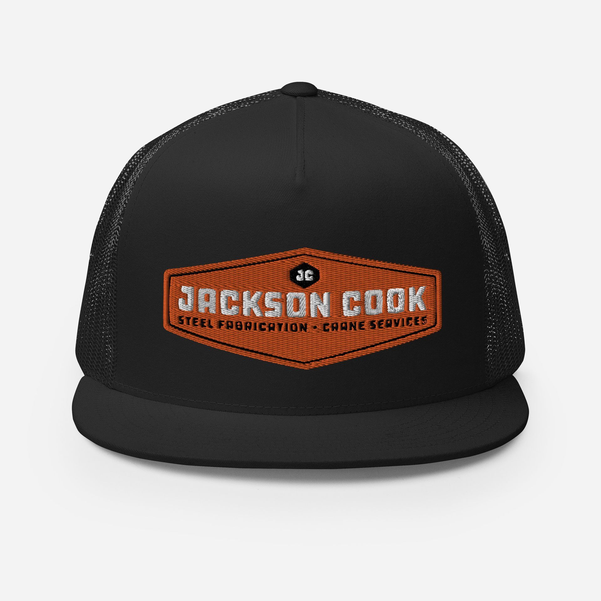
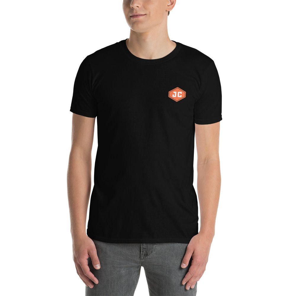
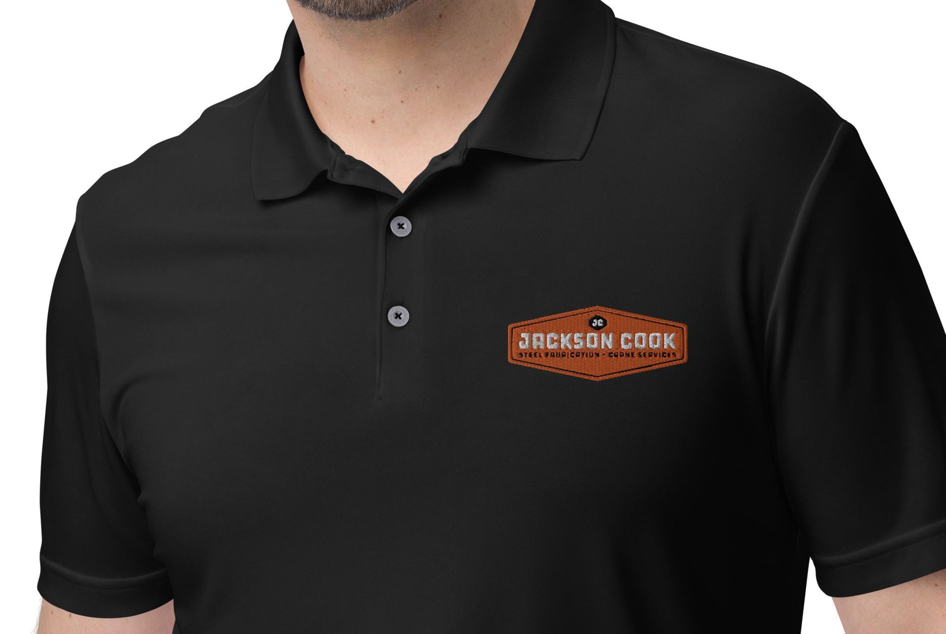
The Jackson Cook logo is responsive with the icon driving the rest of the designs. The icon is a simple JC monogram inside of the oblong hexagon shape. This same shape is repeated at different scales across the other logos. This monogram icon is also present in the other logos and badges in black.
The icon allows for smaller applications like their Facebook profile and apparel. Where a 1:1-sized logo is preferable, the secondary logo or badge shapes can be used.
The brand pattern repeats the outlined shape of the primary logo, overlapping itself repeatedly to form a “steal grate” or linked appearance as a nod to their steel fabrication roots.

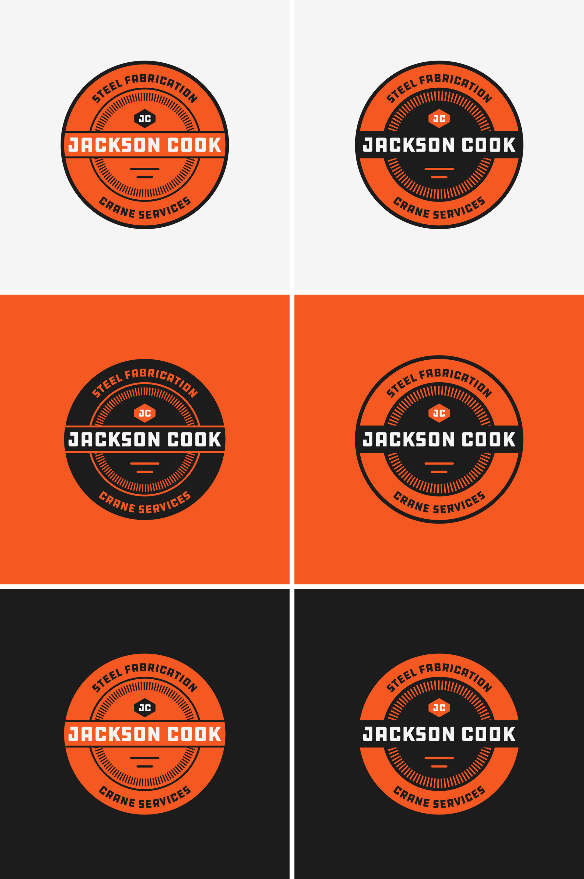
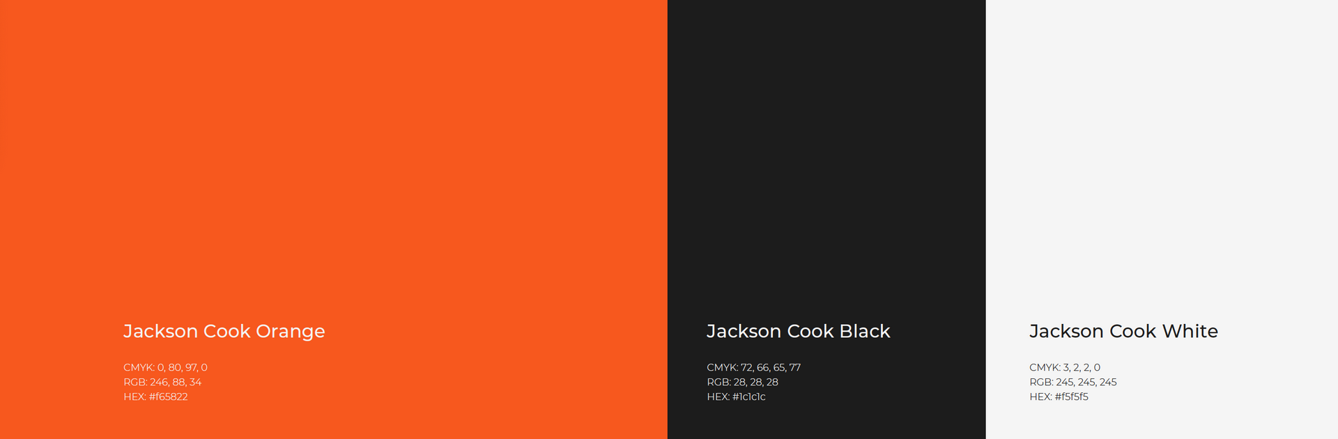
Color and Type:
In the past, Jackson Cook had utilized an orange that was a little too close to competitors but expressed that they’d like to keep some orange and black if possible.
For type, we selected DDC Hardware from DDC Fonts, a division of Draplin Design Co. This is an industrial-style, all-caps font, yet has rounded corners that add a more custom touch. This achieves the established and bold look that Jackson Cook was looking for.


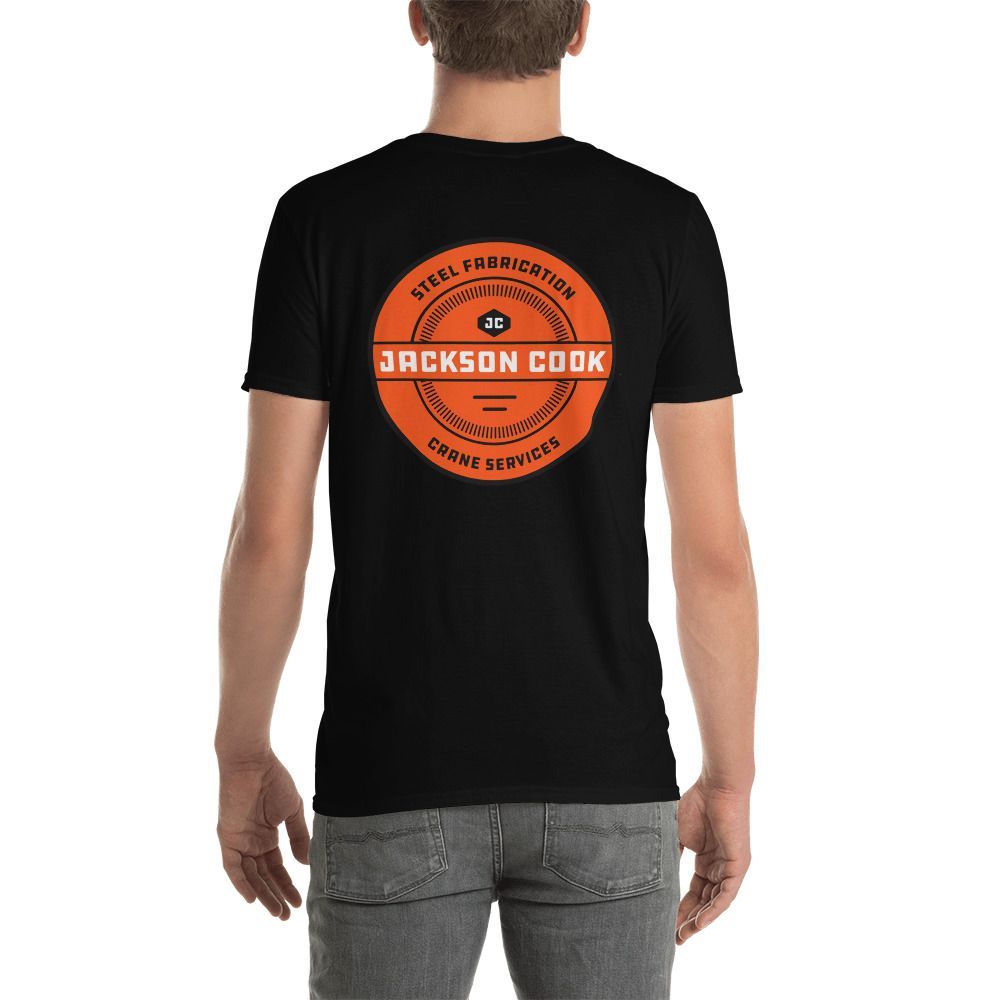
Apparel
It was important to Jackson Cook to include apparel considerations with this new brand launch that employees could feel proud to wear. With several sizes of logos and badges to choose from, we gave Jackson Cook a wide variety of apparel options to utilize. This allows for some individuality while staying consistent in the visual identity.
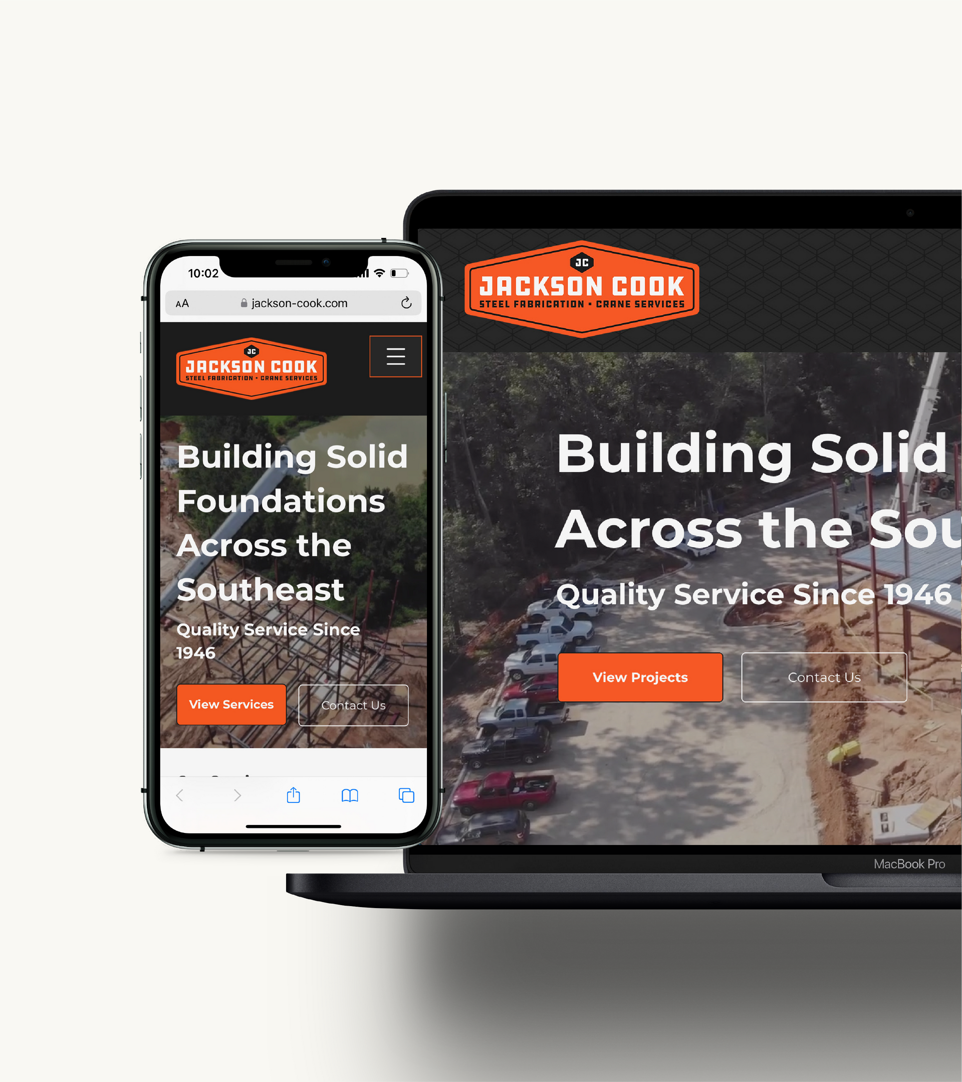
WEBSITE DESIGN
Jackson Cook needed a multi-page website that was clean, informational, and simple. We utilized the brand pattern, colors, and some photos to extend the brand to the site, and also to their Facebook page.
Jackson Cook now has a consistent and distinctive brand that they can be proud of. We also provided them with an extensive Visual Identity Guide document to keep their branding on track.