Nourish by MN350
Podcast Visual Identity
Nourish is a podcast “that features visionary leaders who are creating the regenerative, inclusive, local food economy we need to meet the challenge of climate change.” Their goal is introducing listeners to real-world examples of this food system, discussing how these examples address issues created by our current (industrial) food system, and inviting listeners to take action in support of their guests' work and the work of the MN350 Food Systems Team.
Visual Identity Goal:
Create a Podcast Identity that:
- Remains within the brand guidelines of MN350 and 350.org
- Conveys the harmonious connection between environment, farming, and food
- Simple design that is eye-catching at a small size, but translates well to large applications
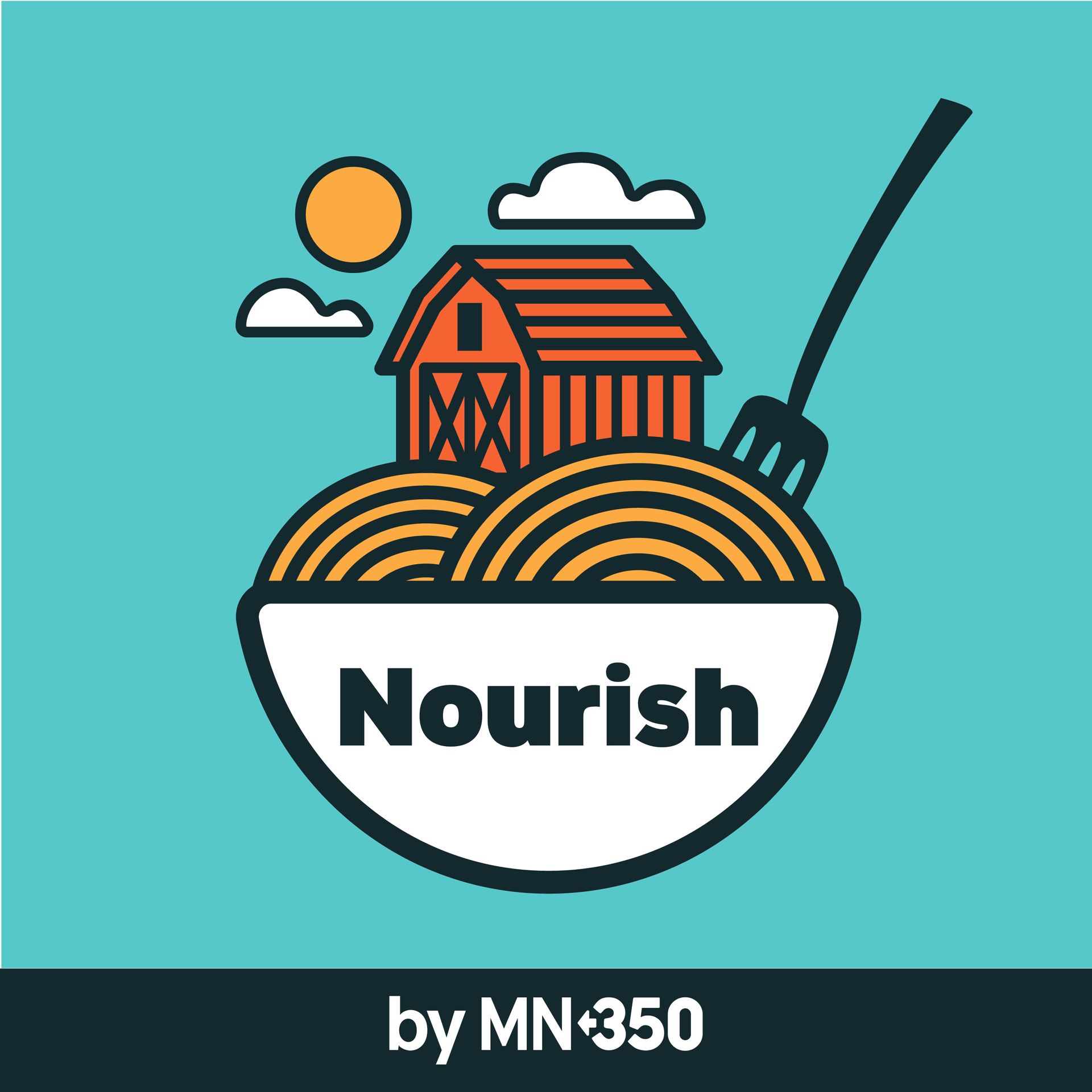
The two most important images to keep in mind were the farm environment and the food, and showing them in direct harmony with each other.
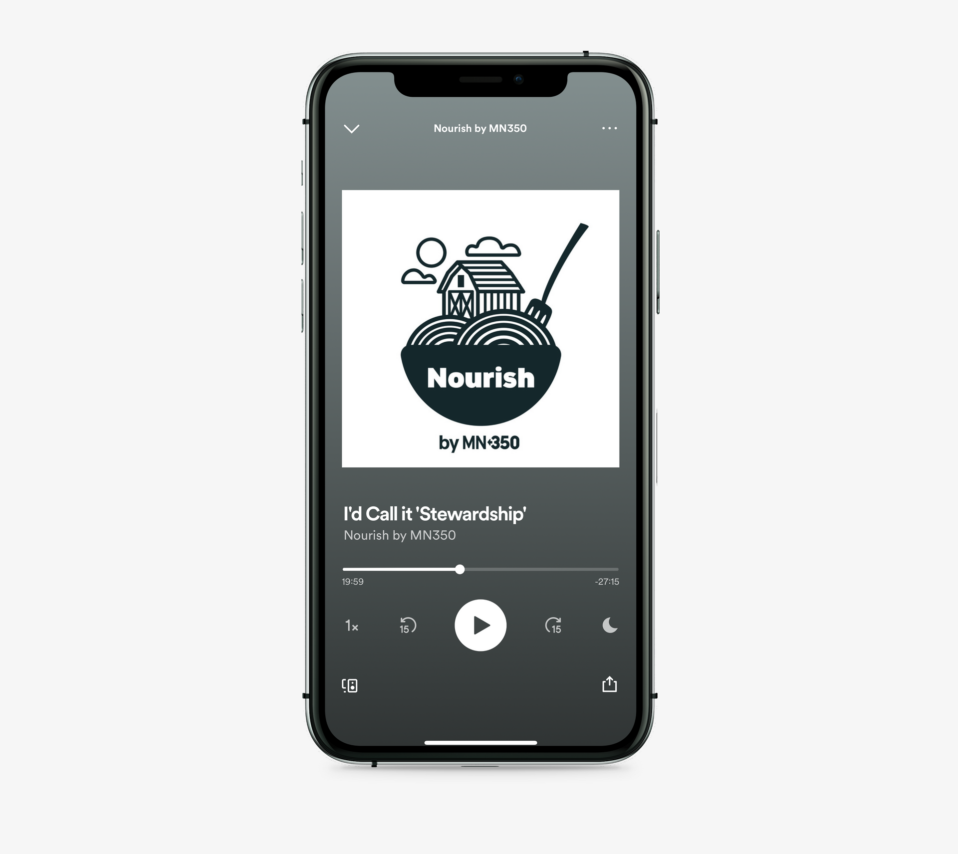
The barn sits on top of rolling hills of crop, which are actually noodles in a bowl complete with a fork/pitchfork combo to bring it together further. A full (branded) color version was created, but the team liked the simplicity of the soft black and white version best.
The Nourish podcast is available on most podcast outlets.