Kala Elkinton
Brand Strategy | Identity Design
Kala Elkinton is an absolute expert on how to photograph, market, and write about hospitality and food. She has worked with local and national brands and restaurants on marketing strategy, food styling, and writing.
Our goal in creating Kala’s personal brand was to craft a brand that looks and sounds like Kala but speaks directly to the hospitality property owners, chefs, and restauranteurs she serves.
The Scope:
- Logo System
- Typography, Color
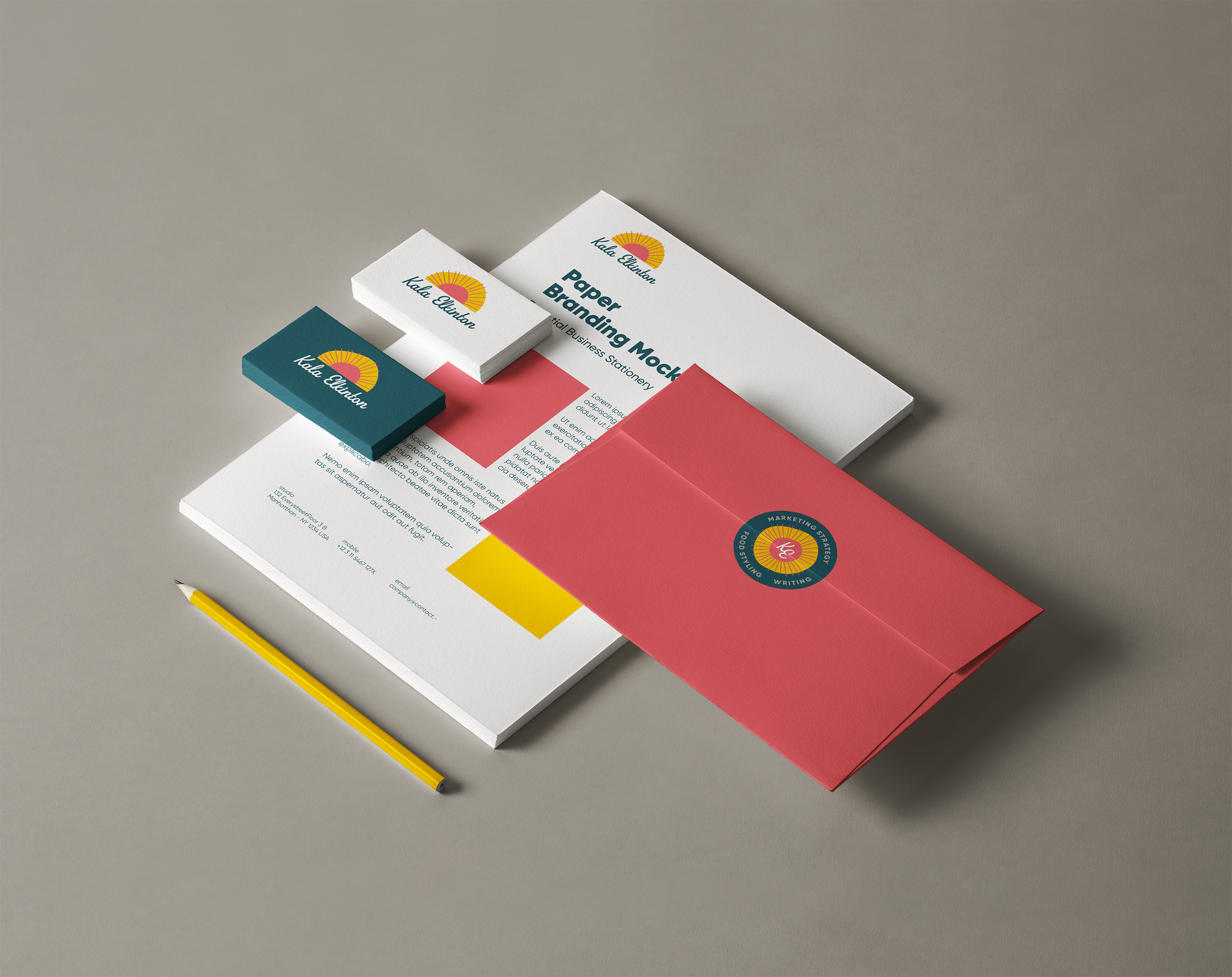
- Print Collateral
- T-Shirts
- Stickers, Coasters
Visual Identity Goal:
Create a bold logo and identity that:
- Expresses Kala’s business vibes: Practical, with a sunny and boldly optimistic disposition
- Appeals to food & hospitality business owners who need a real person and trusted partner to market their company
- Keeps the formula balanced between bold, professional, and handmade (the term “A suit with personality” was the mantra)
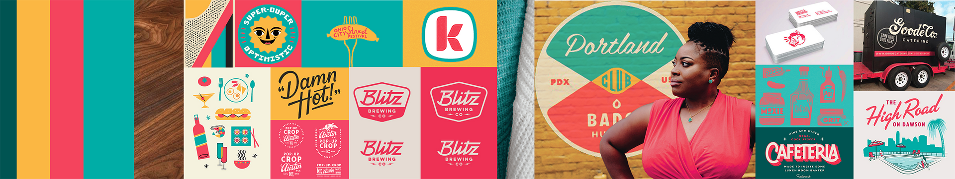
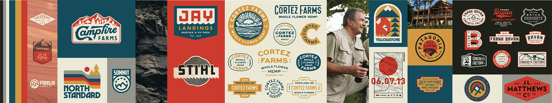
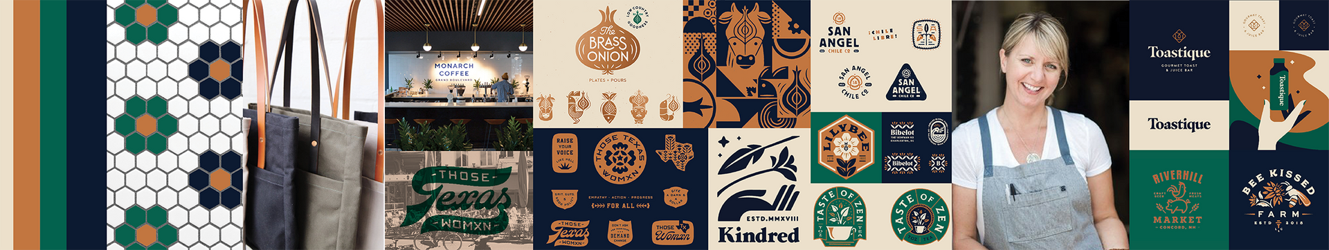
The Stylescapes Process
Stylescape - a design deliverable that helps present the visual language and direction of a project. They consist of fonts, color, logos, images, and digital or physical elements.
As a part of our strategy - we identified 3 key customer types, built user profiles, and created stylescapes for each.
The Final Stylescape:
Through the stylescape process with Kala, we selected the color, type, and design direction that best embodied the attributes that bubbled to the top in strategy sessions: Approachable, Energetic, and Organic

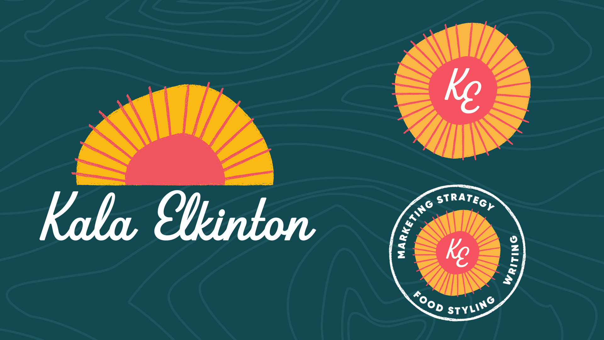

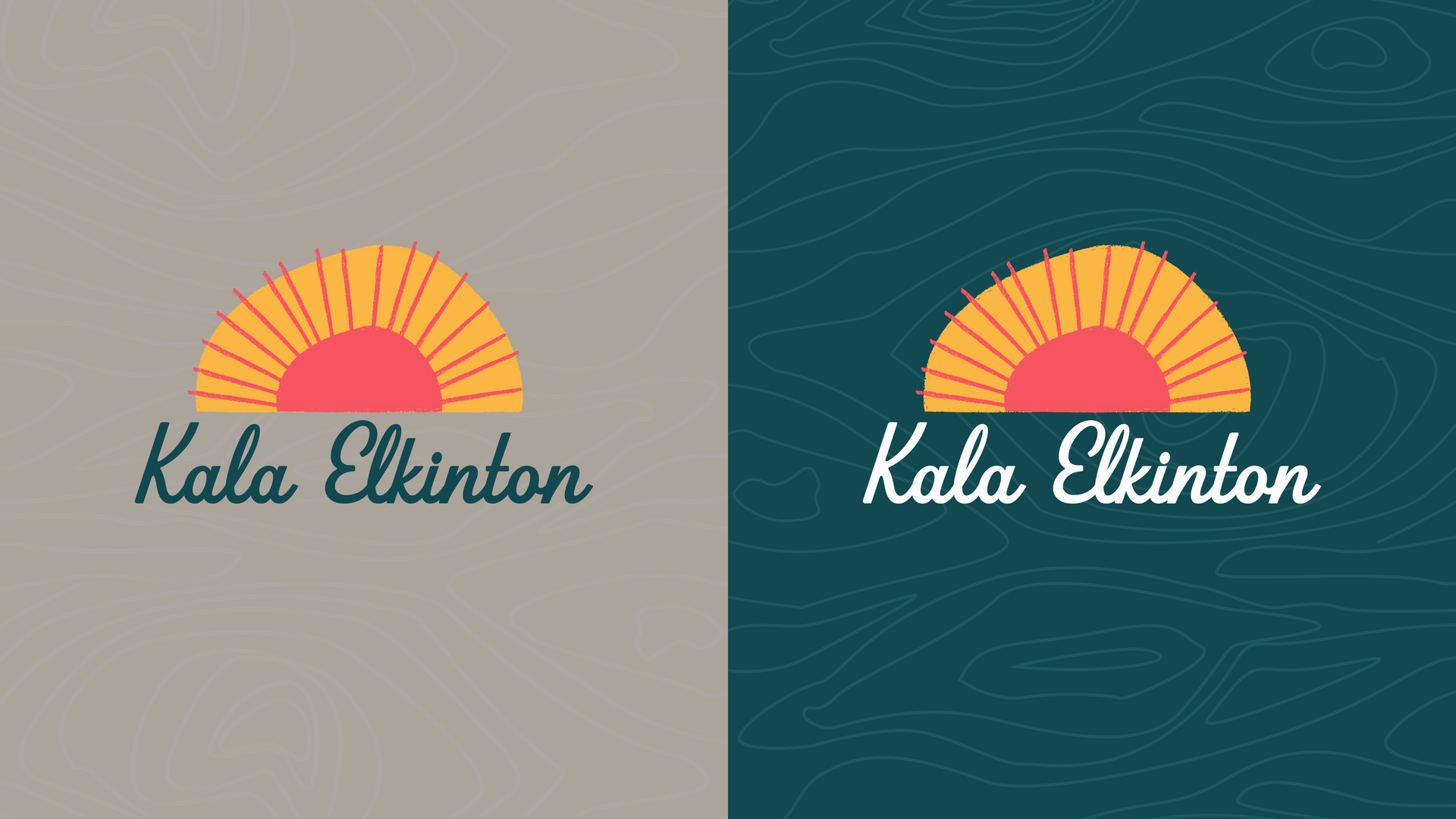
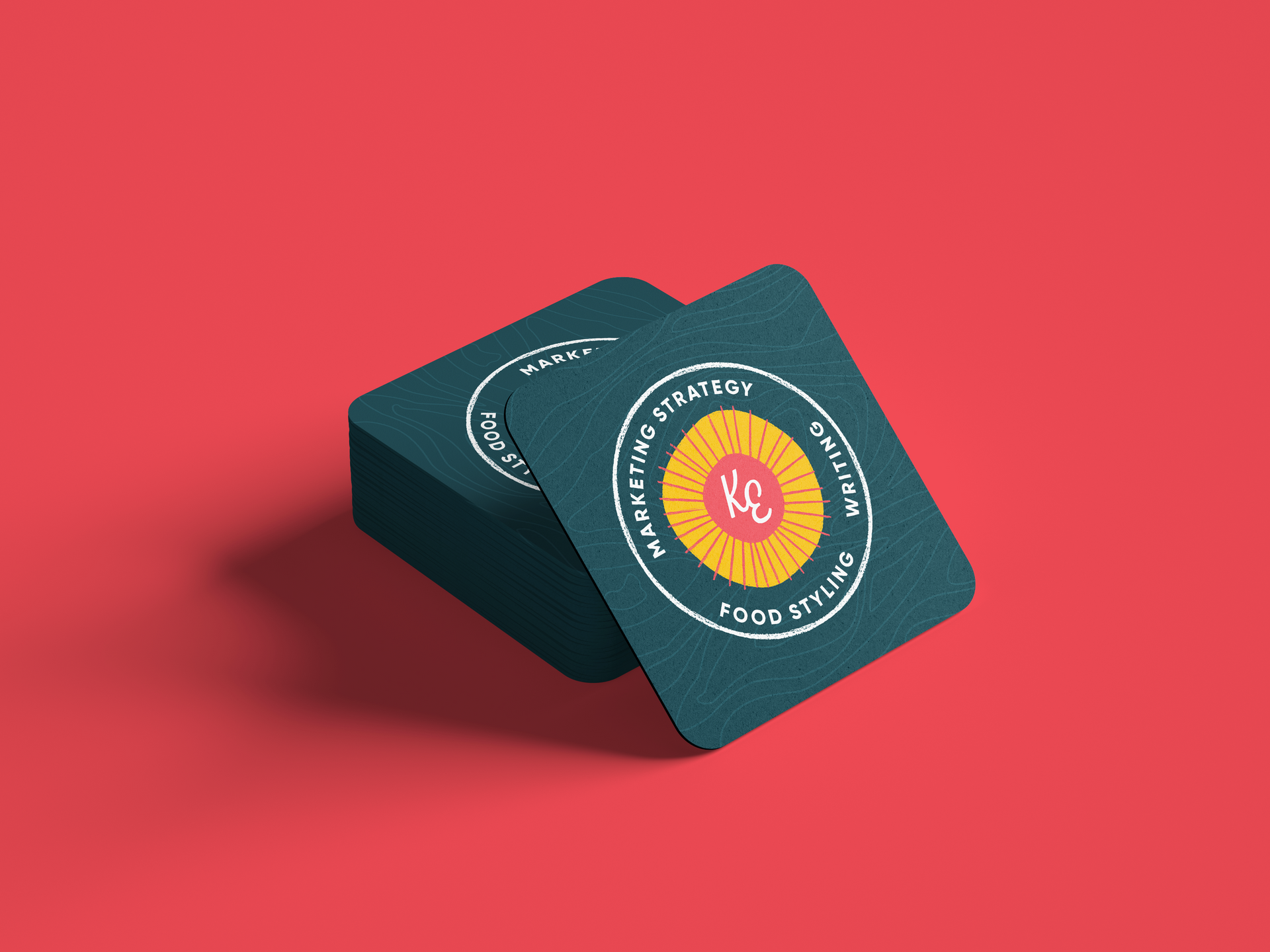
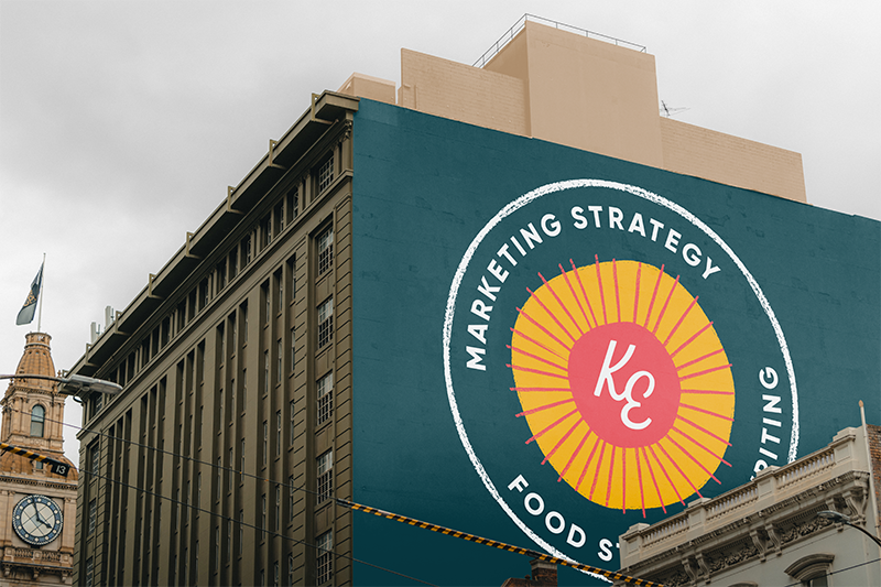
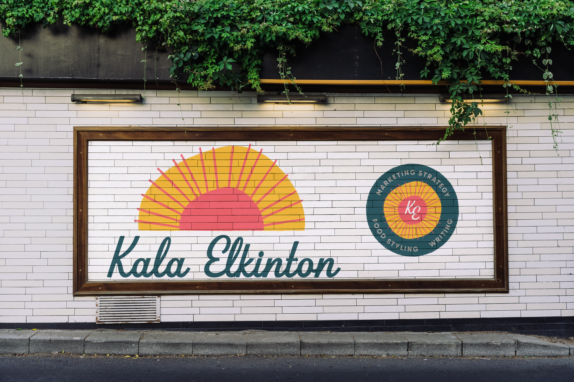
Logo Lockup, Icon, and Badge
Kala’s social handle “Tada Sunshine” paired with the optimism she serves her clients with, made the sun logo a no-brainer. To keep this from looking like a stereotypical “perfect yellow circle with lines” sun, we intentionally chose an abstract and handmade direction. The rays of the sun and the edges of the graphics all have a charcoal pencil look that adds to the organic feel.
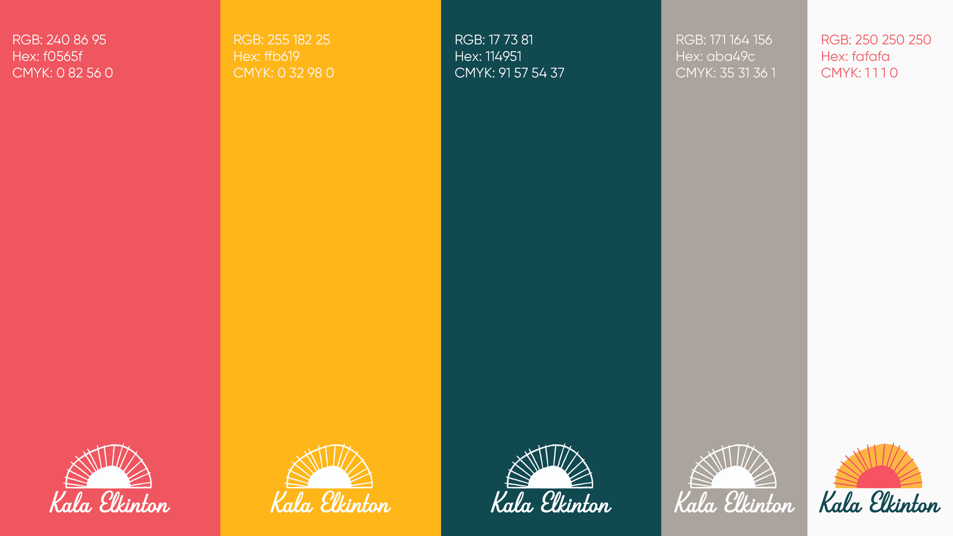
Color and Type
We selected color and type that are bold and indicated a positive, forward moving nature. Something fun with nods to a retro painted script. Beverly Drive Right, by Hoodzpah, is the script with the right amount of nostalgia. The right-leaning script also indicates optimism and forward motion. Gilroy, by Radomir Tinkov, is a modern sans serif that is versatile for copy, secondary headlines, or in a “stamp” for many different uses.

Brand Pattern
The brand pattern / background is a blend between a wood grain and a topographical map. This adds an organic feel and outdoors focused look to her brand - something important to Kala and the clients she wants to continue to work with.
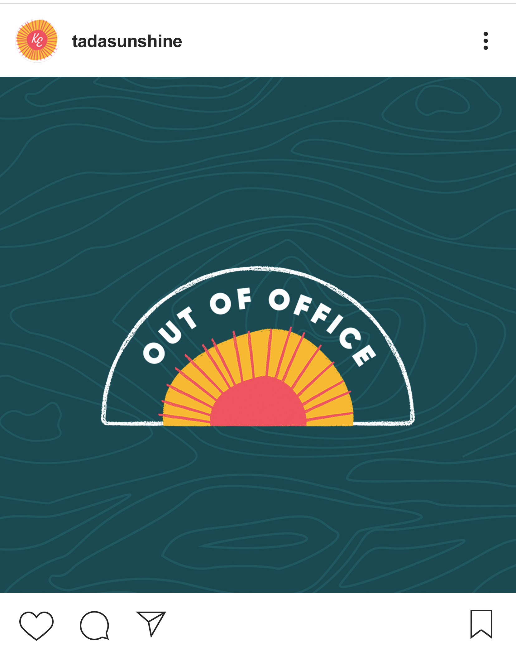
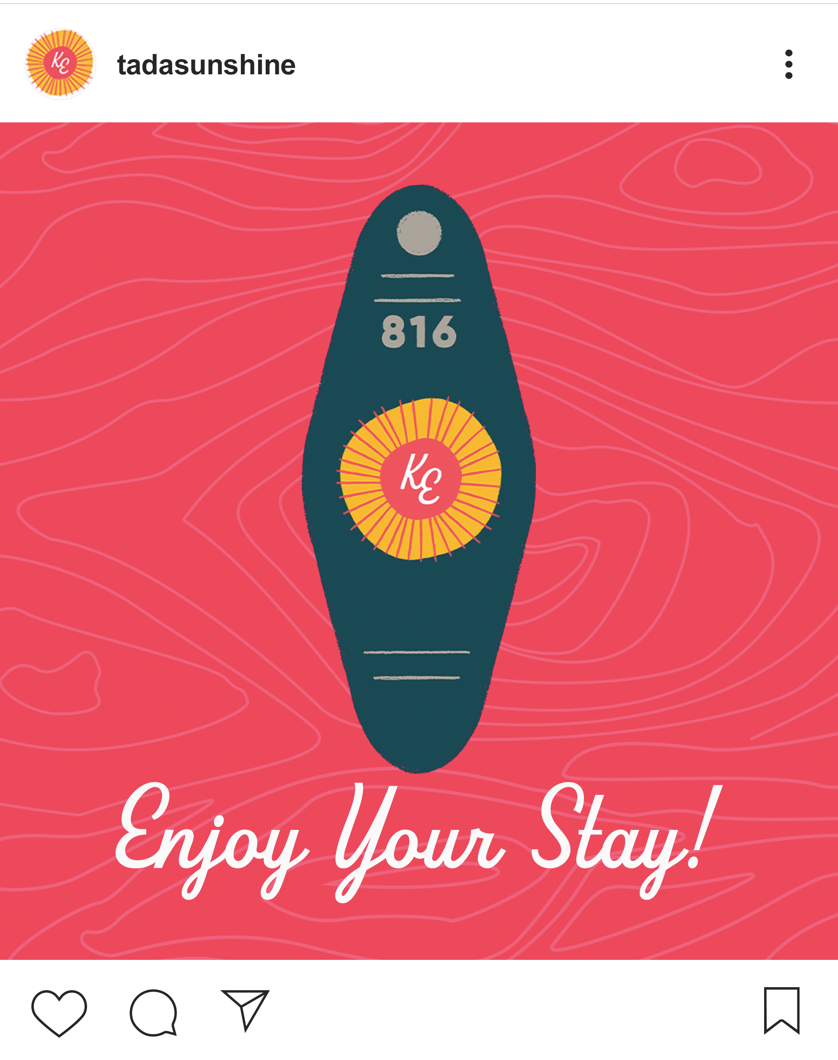
Supporting Images
Icons like the motel keychain and “stamp” are extensions to be applied on social, site, or print where something extra is needed.
Brand Extension
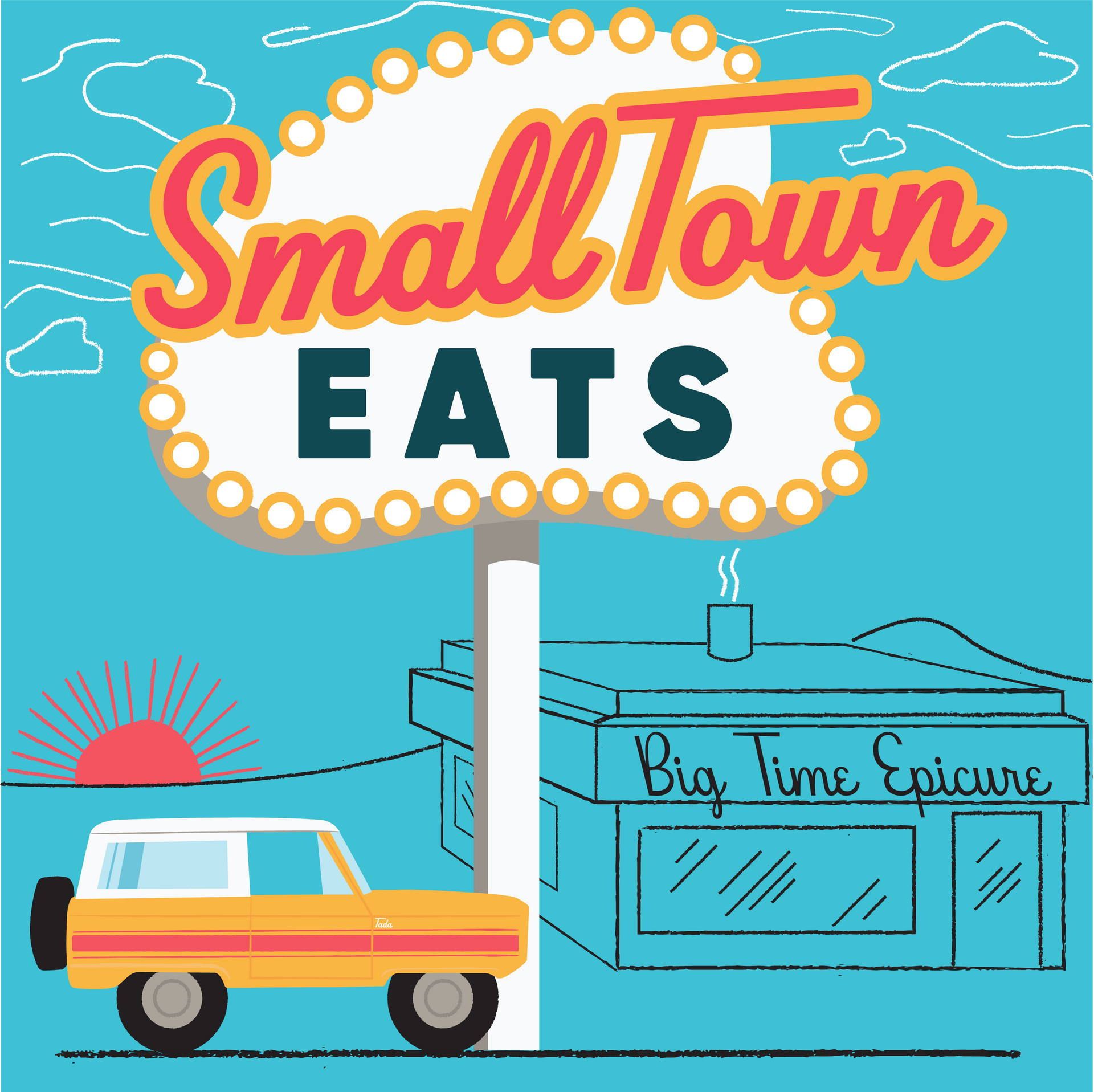
While we were working on this project, Kala started a podcast called Small Town Eats - A show highlighting lesser-known (hidden gem) restaurants outside of metro areas and why they are worth the drive. She asked for us to design this as an extension of her brand and we jumped in!